People were up to 7% more likely to say they would buy a product with dark color (vs light) packaging. The effect backfires if buyers are worried about the product’s risks (e.g. side effects).
You’re launching a new formula for your anti-dandruff shampoo and are trying to finalize the packaging for the new bottle. You’ve shortlisted it to two options – a navy bottle and a pastel blue.
New research shows why the darker bottle is the better pick.
P.S.: Showing multiple copies of your product in an ad (3 bottles next to each other) can also make your product seem more effective.
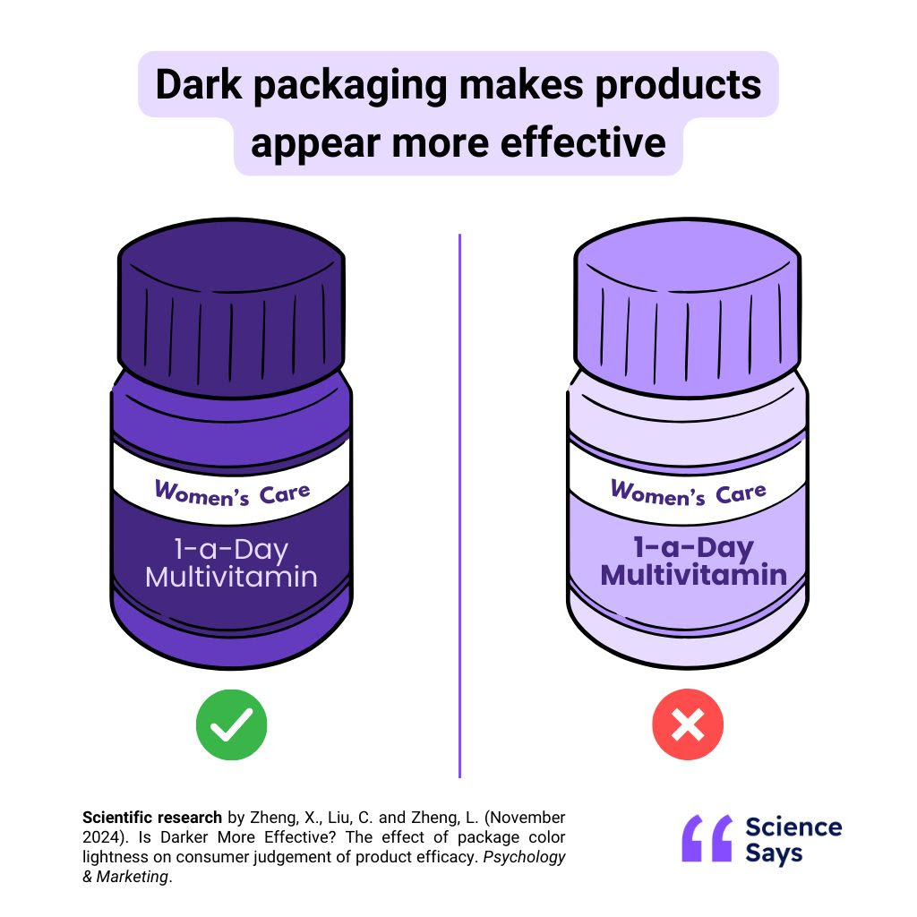
Products with darker packaging seem more effective
Use dark colors if people buy your product for its strength and effectiveness. People will like it more and be more interested in buying it.
Be careful, darker packaging also makes people more concerned about the side effects of a product. If these concerns can demotivate purchases (e.g. for children’s medicines or concerns of sensitive skin), consider lighter-colored packaging.
Findings
Darker packaging makes products seem stronger and more effective. If the product is meant to solve a specific problem and its strength is the main value offering (e.g. to relieve a headache), people will judge the product better and will be more likely to say they’d buy it. However, darker packaging also increases concerns about potential side effects.
As part of a series of 4 experiments, researchers found that people:
- Preferred an anti-hair loss shampoo with darker packaging (65% vs 35%), and judged it 12.3% better
- Were 6.9% more likely to say they would buy shampoos, serums and sunscreens with dark (vs light) packaging
- Were more likely to choose (61% vs 39%) ibuprofen in darker packaging, and judged it 14.1% more effective
- The effect reverses when people are concerned about product safety. For example, those worried about the side effects of a pain reliever were 6.6% more likely to say they would buy a light (vs dark) product
Why it works
When we’re making decisions in a hurry (e.g. doing weekly groceries), we rely on mental shortcuts, to help us decide quickly. Color is one of the mental shortcuts we use to judge products and form opinions about them.
We associate darker colors with stronger, more concentrated substances, based on our experiences with daily items like coffee.
So when we’re looking for a strong solution, we naturally gravitate towards a darker color.
Limitations
- The research tested health and personal care products. However, it’s likely these findings can be generalized to other products where effectiveness is a crucial selling point, such as cleaning products or batteries
- It’s unclear whether this would work for situations beyond packaging, such as the webpage for a cybersecurity company
- The study looked at people’s perceptions of how effective a product was before using it – it’s unknown if using the product would change this perception
- The research analyzed Chinese audiences who may have different associations with colours than other cultures. For example, while Western cultures tend to see red as exciting or dangerous, in China it’s considered the color of good luck. Similarly, the success of darker colors in increasing effectiveness may work differently in other cultures based on unique associations with dark or light colors
Companies using this
Personal care products frequently use darker colors for their packaging, including:
- Skincare brand Nivea’s famous dark blue
- Tresemme’s shampoo range
- L’Oreal’s hair repair shampoo (while sticking to light colors for their general shampoo line)
Health products, including vitamins, supplements, and protein powders often use dark-colored packaging for their products as well.
- While popular painkiller Advil uses dark blue boxes for their general product line, their kid’s products feature white and light blue packaging
- Supplements company GNC uses dark packaging for their men’s multivitamins
Steps to implement
- If your product is bought for a specific purpose (e.g. pain relievers, anti-aging creams), use darker colors in your product packaging to make your product seem stronger and more effective
- You can also make your product seem purer and unadulterated by keeping your packaging as simple as possible
- To further increase the attention paid to your product’s main benefit, use realistic images in your advertising and packaging
- If safety or concern about side effects is a key factor in your customers’ decision-making (e.g. for babycare products, children’s medicines or products for sensitive skin), use lighter colors in your packaging instead
- You can also make your brand seem more safe and reliable by using structured design (e.g. straight lines, symmetry, geometric shapes) in your packaging and branding
- If you’re uncertain which concern would be more important to your customers, A/B test two different variations of your packaging – one with lighter and one with darker packaging, to see which performs better
Source: Science Says.